This function generates a line chart from a data frame using specified x and y variables. Optionally, the plot can be rendered as an interactive Plotly object. The function also allows grouping of data based on a specified grouping variable.
Usage
line_chart(
  dynamic = FALSE,
  base = NULL,
  params = list(df, x, y, ci = NULL, lower = NULL, upper = NULL, error_colour =
    c("#f2c75c"), group_var, line_colour = c("blue"), line_type = "solid", width = 1,
    title = NULL, x_label = NULL, x_label_angle = NULL, y_label = NULL, y_label_angle =
    NULL, y_percent = FALSE, st_theme = NULL, add_points = FALSE, show_gridlines = FALSE,
    show_axislines = TRUE, legend_title = NULL, legend_position = NULL, hline = NULL,
    hline_colour = "red", hline_label = NULL),
  ...
)
Arguments
- dynamic
A logical value. If
TRUE, the line chart will be rendered as a Plotly object for interactivity. IfFALSE, a static ggplot2 object will be returned.- base
A base plotly or ggplot2 object to add the line chart to. Default is
NULL.- params
A list containing the following elements:
dfA data frame containing the data to be plotted.xA character string specifying the name of the column indfto be used for the x-axis.yA character string specifying the name of the column indfto be used for the y-axis.group_varA character string specifying the name of the column indfto be used for grouping the data.ciOptional. A character string specifying the column indffor confidence intervals.lowerOptional. A character string specifying the column indffor lower bounds of confidence intervals.upperOptional. A character string specifying the column indffor upper bounds of confidence intervals.error_colourThe color for error bars. Default is#f2c75c.line_colourList of colours for lines. Default isblue.line_typeLine type for single graph, or list of line types Permissable values: "solid", "dotted", "dashed", "longdash", "dotdash"widthA numeric value specifying the width of the lines.titleOptional. A character string specifying the title of the plot.x_labelOptional. A character string specifying the label for the x-axis.x_label_angleOptional. A numeric value specifying the rotation angle for the x-axis labels.y_labelOptional. A character string specifying the label for the y-axis.y_label_angleOptional. A numeric value specifying the rotation angle for the y-axis labels.y_percentOptional. A logical value. IfTRUE, the y-axis will be scaled to percentages.st_themeOptional. A ggplot2 theme object to customize the style of the plot.add_pointsOptional. A logical value. IfTRUE, points will be added to the line chart.
- ...
Additional arguments passed to
geom_linefor static (ggplot2) plots or toplot_ly/add_tracefor dynamic (Plotly) plots, allowing custom styling of the lines (e.g.,alpha,size,marker, etc.).
Examples
library(dplyr)
#> Warning: package 'dplyr' was built under R version 4.5.1
#>
#> Attaching package: 'dplyr'
#> The following objects are masked from 'package:stats':
#>
#> filter, lag
#> The following objects are masked from 'package:base':
#>
#> intersect, setdiff, setequal, union
library(epiviz)
# Import df lab_data from epiviz and do some manipulation before passing for the test
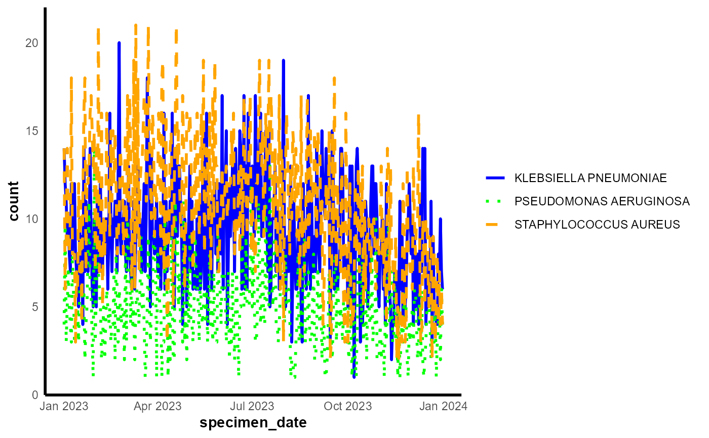
test_df <- epiviz::lab_data
# Manipulating date within df
test_df$specimen_date <- as.Date(test_df$specimen_date)
# Setting start date and end date for aggregation
start_date <- as.Date("2023-01-01")
end_date <- as.Date("2023-12-31")
# Summarization
summarised_df <- test_df |>
group_by(organism_species_name, specimen_date) |>
summarize(count = n(), .groups = 'drop') |>
ungroup() |>
filter(specimen_date >= start_date & specimen_date <= end_date)
# Ensure that summarised_df is a data frame
summarised_df <- as.data.frame(summarised_df)
# Create params list
params <- list(
df = summarised_df, # Ensure this is correctly referencing the data frame
x = "specimen_date", # Ensure this matches the column name exactly
y = "count", # Ensure this matches the column name exactly
group_var = "organism_species_name", # Ensure this matches the column name exactly
line_colour = c("blue","green","orange"),
line_type = c("solid", "dotted", "dashed")
)
# Generate the line chart
line_chart(params = params, dynamic = FALSE)
 # Generate the line chart
result <- epiviz::line_chart(params = params, dynamic = FALSE)
# Import df lab_data from epiviz and do some manipulation before passing for the test
test_df <- epiviz::lab_data
# Manipulating date within df
test_df$specimen_date <- as.Date(test_df$specimen_date)
# Setting start date and end date for aggregation
start_date <- as.Date("2023-01-01")
end_date <- as.Date("2023-12-31")
# Summarization
summarised_df <- test_df |>
group_by(organism_species_name, specimen_date) |>
summarize(count = n(), .groups = 'drop') |>
ungroup() |>
filter(specimen_date >= start_date & specimen_date <= end_date)
# Ensure that summarised_df is a data frame
summarised_df <- as.data.frame(summarised_df)
# Create params list
params <- list(
df = summarised_df, # Ensure this is correctly referencing the data frame
x = "specimen_date", # Ensure this matches the column name exactly
y = "count", # Ensure this matches the column name exactly
group_var = "organism_species_name", # Ensure this matches the column name exactly
line_colour = c("blue","green","orange"),
line_type = c("solid", "dotted", "dashed")
)
# Generate the line chart
epiviz::line_chart(params = params, dynamic = TRUE)
# Generate the line chart
result <- epiviz::line_chart(params = params, dynamic = FALSE)
# Import df lab_data from epiviz and do some manipulation before passing for the test
test_df <- epiviz::lab_data
# Manipulating date within df
test_df$specimen_date <- as.Date(test_df$specimen_date)
# Setting start date and end date for aggregation
start_date <- as.Date("2023-01-01")
end_date <- as.Date("2023-12-31")
# Summarization
summarised_df <- test_df |>
group_by(organism_species_name, specimen_date) |>
summarize(count = n(), .groups = 'drop') |>
ungroup() |>
filter(specimen_date >= start_date & specimen_date <= end_date)
# Ensure that summarised_df is a data frame
summarised_df <- as.data.frame(summarised_df)
# Create params list
params <- list(
df = summarised_df, # Ensure this is correctly referencing the data frame
x = "specimen_date", # Ensure this matches the column name exactly
y = "count", # Ensure this matches the column name exactly
group_var = "organism_species_name", # Ensure this matches the column name exactly
line_colour = c("blue","green","orange"),
line_type = c("solid", "dotted", "dashed")
)
# Generate the line chart
epiviz::line_chart(params = params, dynamic = TRUE)